

The Class Management Hub is an educator-facing dashboard that enables educators to track learner progress and deliver targeted support remotely. I designed the MVP end to end, translating complex needs into intuitive flows and a responsive UI that scales learning support with limited resources.
Previously, Oppia relied on independent learning or in-person educator support, limiting educators’ ability to track progress and provide timely guidance at scale.

Problem Factors:
By knowing the current problem and its factors, I clarified three goals of this design project for the facilitator-facing platform:
Batch Management: Classify learners into groups and batch manage them.
Remote Tracking: Understand learners’ progress and struggles even though they are not present with learners.
Targeted Guides: Suggest lesson plan and assign practices based on learners' performance.
Oppia can hire volunteer facilitators worldwide to oversee learners and provide guidance.
The increasing number of learners can still get high-quality guidance from facilitators.
The feature empowers Oppia to gather learning data with learners' consent, contributing to the future improvement of the learning platform and facilitator-facing tools.
Challenge:

The lo-fi wireframes have been already established, organized by user cases, so--
Solutions:
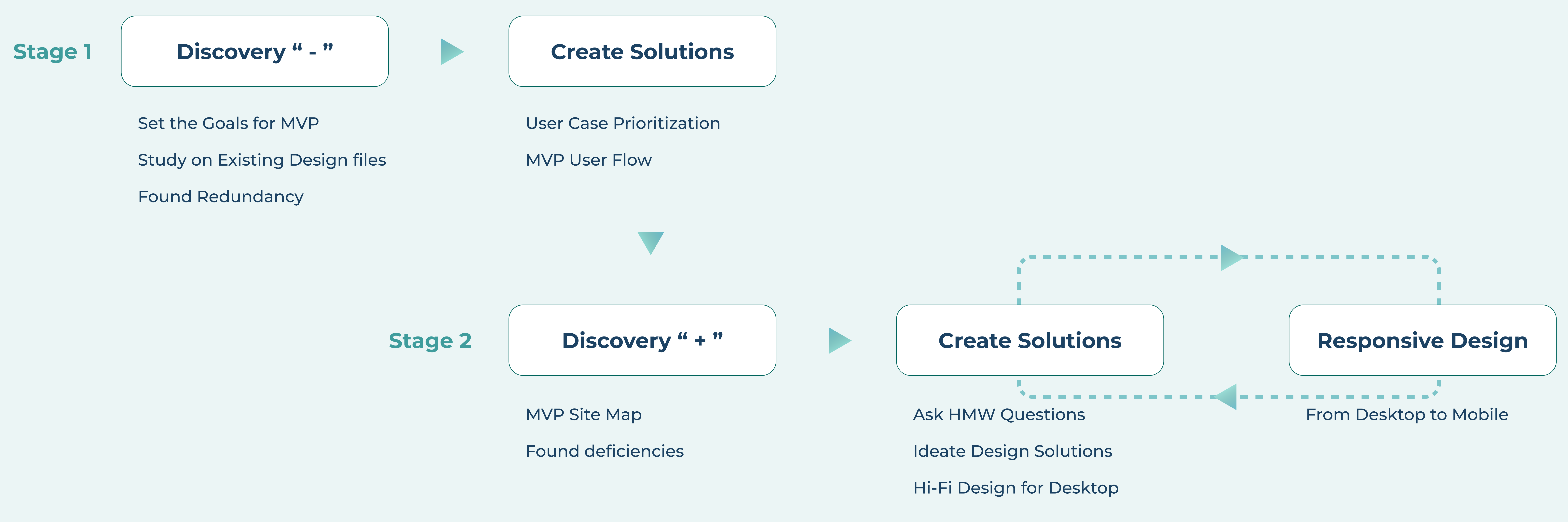
As the prioritized user cases were listed by the previous designer and the PM, our current focus is on determining how to connect them together to create an essential user flow that forms the foundation of the minimum viable product (MVP).
We used prioritization matrix to identify the most important user cases for MVP, meatured by user value and developing effort. Selected user cases (marked with stars) will serve as the "building blocks" to frame the MVP use flow in the next step.


With those user case "blocks" marked with stars, we re-arranged them to create the MVP user flow. Our goal is to establish a cohesive and streamlined experience that addresses the core needs of our users based on the identified priority cases.
We also ensured that the project goals could be thoroughly achieved by following the user flow.

Challenge:
When I attempted to align the Mid-fi wireframes from the previous designer, which were organized by separate user cases, with the MVP user flow created above, I noticed that some parts were likely missing.
Discover the "gaps":
With the MVP user flow mapped out, we matched the previous designed pages to the flow chart to determine if the indivisual pieces can be seamlessly connected to create the streamlined experience of the MVP. The blue comments below highlight the "gaps" we identified from the integrated wireflow.
.jpg)
Find and conclude the "gaps"
To help improve the group managing experience:
HMW enable the first-time users (facilitators) to quickly understand the situation and take the action to create their first learner group?
To help improve lesson search and assigning experience:
HMW show lessons just added, not added, and already in the syllabus in one list?
To help improve the overall work efficiency for facilitators:
HMW allow users (facilitators) to switch among functions or return to the main dashboard?
While solely focusing on ensuring the functionality of the new feature, it is easy to overlook the importance of the empty state when no input has been made yet. However, upon mapping out the user flow, I noticed that the empty state of the learner group dashboard was missing.
Below, you can see a comparison of the empty state of the Learner Group dashboard versus the dashboard with learner groups created.
Learner Group Dashboard at empty state
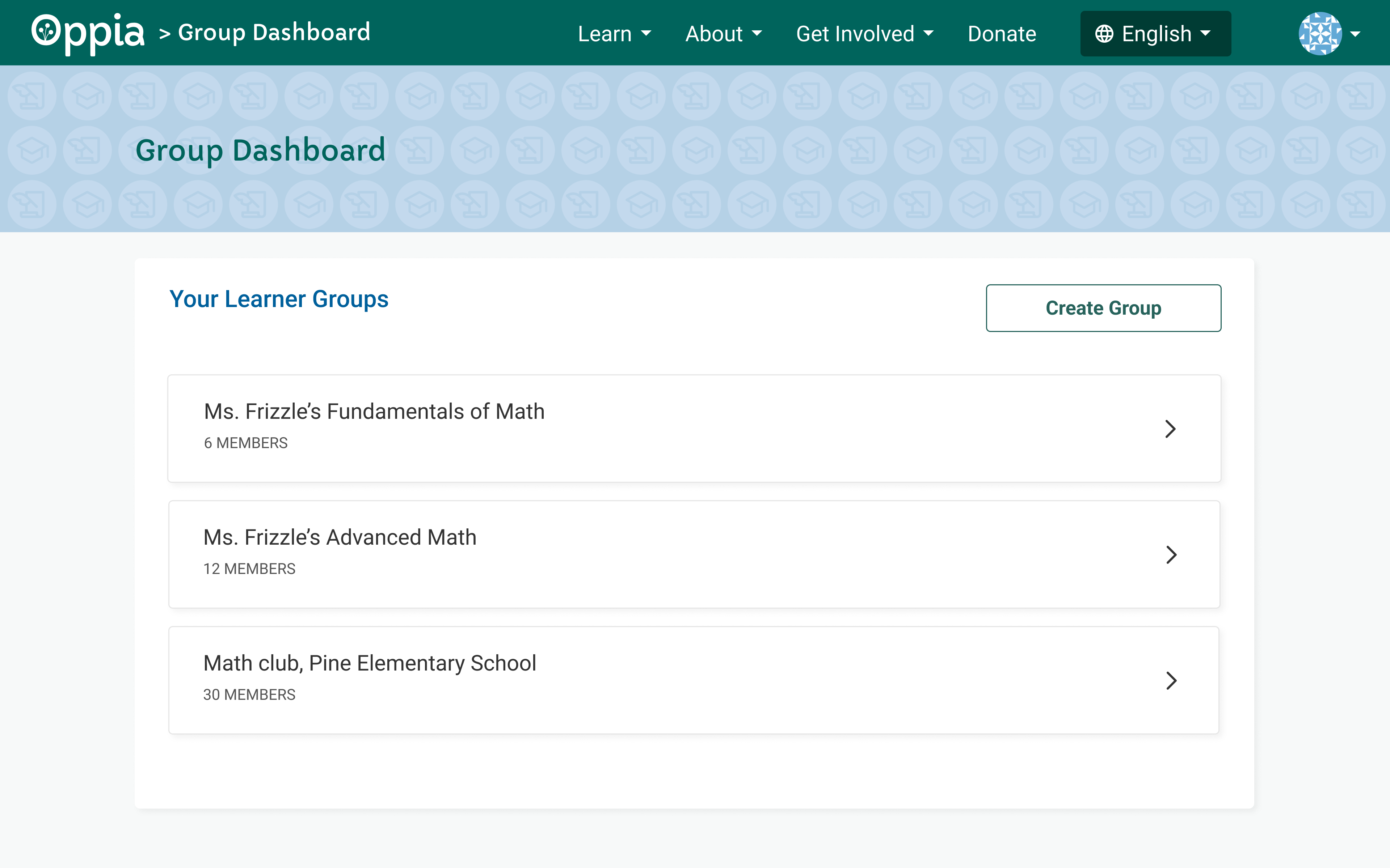
Learner Group Dashboard with groups created
Design with High Visual Perception
We received feedback from the UX research team that the all-text version of the empty state Group Dashboard may slow down reading speed, not only for young learners but also for facilitators who may have already read a considerable amount of text-heavy lesson content.
To enhance visual perception, I centered all page-specific content and added graphics above it, so users are first attracted by the graphic, then read the prompt for the "Create Group" action. The internal test during team design review meeting demonstrated that the users can understand the prompt and take action faster with the improved empty state page.
The user experience of searching and selecting items for the learner group syllabus reminds me of the online shopping experience. I decided to imitate the typical online shopping user flow to make the experience more intuitive and straightforward, leveraging users' mental model based on their previous shopping experiences.

Problem from Previous Design
No "Return" Flow: The previously designed user flow only allows facilitators to access or switch between sub-features, but there is no way to return to the main dashboard, which also includes switchable content.
Flat Information Structure: When facilitators select to view specific learner details, the tabs allowing them to switch between "Skills Analysis" and "Progress in Stories" function in the same way as the tabs on the main dashboard page. The similarity of "upper" and "lower"-level pages flattens the information structure, making user navigation unclear.

Guided by the Sitemap
To enable users to "return" from sub-features to the main dashboard, I realized that we need to rethink the hierarchy and restructure the information architecture first because the user flow is not one-directional.

Optimized Navigation
In order to clarify the hierarchy and enable users to navigate freely among multi-leveled sections without getting lost, I made the following updates:
Shifted the primary section titles to the sidebar, ensuring users can view and switch among primary topics from any page;
Retained secondary sections as horizontal tabs, and right on top of content, positioned directly above the content, as they have a closer relationship to the displayed content;
Slightly adjusted the main content column, moving it closer to the sidebar from the center. This reduces the visual distance between primary level sections and secondary sections or content.

Considering the limited width yet more flexibility of height on mobile screens, we shifted the primary section bar to the top, just below the general top menu and group name. Secondary sections are now below the primary section bar. This approach keeps main sections fixed at the top, enabling easy facilitator switching, with scrollable content centered for focused information.
(Note: Given that over 70% of Oppia's volunteer facilitators are based in developing countries and rely on older Android mobile devices, the responsive design of this project starts from the dimensions of 360 x 800 px, commonly used for older models. More recent Android phones with higher resolutions and larger screens will comfortably accommodate menus and content.)

The Learner Group feature was fully implemented and launched in November 2022.
Facilitators can now flexibily determine the number and sizes of groups they manage based on their available volunteer time.
With the Learner Group feature, facilitators can effectively oversee up to 120 learners, a significant increase compared to just 1 to 2 learners in an in-person setting.
The learning data reflected in the feature empowers facilitators to provide more informed guidance to learners. Additionally, it enables the broader Oppia team to enhance the learning experience through thorough data analysis.
Dive deep into learner evaluation:
Are we displaying the correct information in a visual format that aids facilitators in efficiently assessing learners' progress and skills? This is the question I continually ask myself throughout the design process. In future iterations, we will enhance the presentation of learners' progress and skill mastery, as measured by learning frequency, answered questions, achieved checkpoints, etc., in order to offer more focused learning guidance.
Optimize the Learner Group "Overview" Page
Given the linear content structure, our current use of tabs for topic/section navigation is limited. Anticipating more learner information on the "Overview" page in the future, it would be prudent to contemplate a modular structure. This organizational approach will transform the page into a more dashboard-like layout, enhancing both its presentation and responsiveness across various screen sizes.
Associate to the learner-facing Learner Group feature
The Learner Group feature aims to aid facilitators in efficiently managing and guiding learners as groups. Reflecting facilitator instructions on learner-facing interfaces is crucial for effective guidance, promoting learner benefit and motivation.